
Advanced Fields
Professional custom fields for Strapi CMS that provide advanced functionality with comprehensive validation, dynamic options, and user-friendly interfaces.
Latest version
released April 9, 2026
npm install @webbycrown/advanced-fields🚀 Advanced Fields for Strapi



Professional custom fields for Strapi CMS that provide advanced functionality with comprehensive validation, dynamic options, and user-friendly interfaces.
NPM Package: @webbycrown/advanced-fields
Strapi Market: https://market.strapi.io/plugins/@webbycrown-advanced-fields
📘 User Guide
📺 Learn how to use Advanced Fields in Strapi with our step-by-step guide

Direct link: https://www.webbycrown.com/guides/advanced-fields-for-strapi/implementation-guide
🎥 Overview & Usage Demo
A short introduction and quick overview of Advanced Fields for Strapi, showcasing available field types, configuration options, and real-world usage inside the Strapi admin panel.
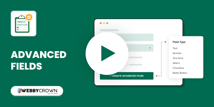
▶️ Watch Full Video on YouTube
🛠️ Installation
Via npm
npm install @webbycrown/advanced-fieldsVia yarn
yarn add @webbycrown/advanced-fields✨ Features
🔤 Advanced Input
- Text Input Field: Simple, clean text input with advanced validation
- Comprehensive Validation: Min/max length, regex patterns, required fields
- Custom Error Messages: User-friendly validation feedback
- Default Values: Pre-filled content for new entries
- Placeholder Support: Helpful hints for content creators
- Field Notes: Display helpful notes below the field
- Private Fields: Hide sensitive data from API responses
☑️ Advanced Checkbox
- Single & Multiple Modes: Toggle between single checkbox or multiple selections
- Dynamic Options: Define options with value|label format
- Min/Max Validation: Control minimum and maximum selections
- Layout Options: Vertical, horizontal, or grid layouts
- Default Selections: Pre-select options for new entries
- Field Notes: Display helpful notes below the field
🔘 Advanced Radio
- Single & Multiple Selection: Choose between single or multiple radio selections
- Dynamic Options: Flexible option configuration
- Selection Limits: Control minimum and maximum choices
- Layout Flexibility: Multiple visual layouts
- Custom Validation: Tailored error messages
- Field Notes: Display helpful notes below the field
🧩 Advanced Enumeration
- Multiple Enum Selection: Select multiple predefined values
- Enum-style Options: Maintain structured enum-like values
- Min/Max Selection Control: Limit how many options can be selected
- Default Selected Values: Preselect values for new entries
- Custom Validation: Tailored error messages
- Field Notes: Display helpful notes below the field
🎨 Advanced ColorPicker
- Multiple Color Formats: HEX, RGB, RGBA, HSL support
- Color Picker UI: Modern interactive color selector
- Manual Input Support: Enter custom color values
- Opacity Control: RGBA alpha transparency support
- Default Color: Predefine color for new entries
- Palette Options: Provide predefined color sets
- Validation Rules: Restrict allowed formats or values
⚙️ Configuration
- Install the plugin in your Strapi project
- Restart your Strapi server
- Navigate to Content-Type Builder
- Add a new field and select one of the Advanced Fields:
- Advanced Input
- Advanced Checkbox
- Advanced Radio
- Advanced Enumeration
- Advanced ColorPicker
📖 Usage Examples
Advanced Input Configuration
// Example: Text validation with custom error message and field note
{
  "required": true,
  "maxLength": 255,
  "minLength": 3,
  "regex": "^[a-zA-Z0-9\\s]+$",
  "options": {
    "customErrorMessage": "Please enter valid text",
    "placeholder": "Enter your text here",
    "defaultValue": "Default text",
    "fieldNote": "This field accepts alphanumeric characters and spaces only"
  }
}
Advanced Checkbox Configuration
// Example: Multiple checkbox with validation and field note
{
  "required": true,
  "options": {
    "checkboxType": "multiple",
    "checkboxOptions": "1|Option 1\n2|Option 2\n3|Option 3",
    "minChoices": 1,
    "maxChoices": 2,
    "layout": "vertical",
    "defaultSelected": "1\n2",
    "fieldNote": "Please select at least 1 and at most 2 options"
  }
}
Advanced Radio Configuration
// Example: Single radio with dynamic options and field note
{
  "required": true,
  "options": {
    "selectionType": "single",
    "radioOptions": "small|Small\nmedium|Medium\nlarge|Large",
    "layout": "horizontal",
    "defaultSelected": "medium",
    "fieldNote": "Choose the size that best fits your needs"
  }
}
Advanced Enumeration Configuration
// Example: Enumeration with dynamic options and field note
{
  "required": true,
  "options": {
    "enumOptions": "red|Red\nblue|Blue\ngreen|Green\nyellow|Yellow",
    "defaultSelected": "red\nblue",
    "minChoices": 1,
    "customErrorMessage": "Please select at least one color",
    "fieldNote": "You can select up to 3 colors"
  }
}
Advanced Color Configuration
// Example: Color picker with default value and validation
{
  "required": true,
  "options": {
    "format": "hex", // hex | rgb | rgba | hsl
    "allowOpacity": true,
    "defaultValue": "#3498db",
    "presetColors": "#ff0000\n#00ff00\n#0000ff\n#ffffff\n#000000",
    "customErrorMessage": "Please select a valid color",
    "fieldNote": "You can choose or enter a custom color"
  }
}
🎯 Field Options Reference
Advanced Input Options
| Option | Type | Description | Default |
|---|---|---|---|
required | boolean | Field is required | false |
unique | boolean | Values must be unique | false |
maxLength | number | Maximum character length | 0 (unlimited) |
minLength | number | Minimum character length | 0 |
regex | string | Validation pattern | "" |
options.defaultValue | string | Pre-filled value | "" |
options.placeholder | string | Placeholder text | "" |
options.customErrorMessage | string | Custom error message | "" |
options.fieldNote | string | Helpful note displayed below field | "" |
private | boolean | Hide from API | false |
Advanced Checkbox Options
| Option | Type | Description | Default |
|---|---|---|---|
required | boolean | Field is required | false |
options.checkboxType | string | single or multiple | single |
options.checkboxOptions | string | Options in value|label format | "" |
options.defaultSelected | string | Pre-selected options | "" |
options.minChoices | number | Minimum selections | 0 |
options.maxChoices | number | Maximum selections | 0 |
options.layout | string | vertical, horizontal, or grid | vertical |
options.customErrorMessage | string | Custom error message | "" |
options.fieldNote | string | Helpful note displayed below field | "" |
private | boolean | Hide from API | false |
Advanced Radio Options
| Option | Type | Description | Default |
|---|---|---|---|
required | boolean | Field is required | false |
options.selectionType | string | single or multiple | single |
options.radioOptions | string | Options in value|label format | "" |
options.defaultSelected | string | Pre-selected options | "" |
options.minChoices | number | Minimum selections | 0 |
options.maxChoices | number | Maximum selections | 0 |
options.layout | string | vertical, horizontal, or grid | vertical |
options.customErrorMessage | string | Custom error message | "" |
options.fieldNote | string | Helpful note displayed below field | "" |
private | boolean | Hide from API | false |
Advanced Enumeration Options
| Option | Type | Description | Default |
|---|---|---|---|
required | boolean | Field is required | false |
options.enumOptions | string | Options in value|label format | "" |
options.defaultSelected | string | Pre-selected options | "" |
options.minChoices | number | Minimum selections | 0 |
options.maxChoices | number | Maximum selections | 0 |
options.customErrorMessage | string | Custom error message | "" |
options.fieldNote | string | Helpful note displayed below field | "" |
private | boolean | Hide from API | false |
🎯 Field Options Reference (Advanced Color)
| Option | Type | Description | Default |
|---|---|---|---|
required | boolean | Field is required | false |
options.format | string | hex, rgb, rgba, hsl | hex |
options.allowOpacity | boolean | Enable alpha (RGBA) | false |
options.defaultValue | string | Default color value | "" |
options.presetColors | string | Preset colors (newline separated) | "" |
options.customErrorMessage | string | Custom validation message | "" |
options.fieldNote | string | Helpful note below field | "" |
private | boolean | Hide from API | false |
🔧 API Usage
Retrieving Data
// GET /api/articles
{
  "data": [
    {
      "id": 1,
      "attributes": {
        "title": "Sample Article",
        "advancedInput": "user@example.com",
        "advancedCheckbox": ["1", "2"],
        "advancedRadio": ["medium"]
      }
    }
  ]
}
Creating/Updating Data
// POST /api/articles
{
  "data": {
    "title": "New Article",
    "advancedInput": "new@example.com",
    "advancedCheckbox": ["1", "3"],
    "advancedRadio": ["large"]
  }
}
Retrieving Data
// GET /api/articles
{
  "data": [
    {
      "id": 1,
      "attributes": {
        "title": "Sample Article",
        "advancedInput": "user@example.com",
        "advancedCheckbox": ["1", "2"],
        "advancedRadio": ["medium"],
        "advancedEnumeration": ["Red", "Green","Blue"]
      }
    }
  ]
}
🎨 Layout Options
Vertical Layout
Options are stacked vertically for easy scanning.
Horizontal Layout
Options are arranged in a horizontal row for compact forms.
Grid Layout
Options are displayed in a responsive grid for better space utilization.
✅ Validation Features
- Real-time Validation: Immediate feedback during content creation
- Custom Error Messages: Tailored validation messages for better UX
- Required Field Validation: Prevents saving without required data
- Pattern Validation: Regex support for complex validation rules
- Selection Limits: Control minimum and maximum choices
- Unique Value Validation: Ensure data uniqueness across entries
🚀 Performance
- Optimized Rendering: Efficient React components
- Lazy Loading: Components loaded only when needed
- Minimal Bundle Size: Lightweight implementation
- Memory Efficient: Optimized for large datasets
🔒 Security
- Input Sanitization: Automatic data sanitization
- XSS Protection: Built-in security measures
- Private Fields: Hide sensitive data from API responses
- Validation: Server-side validation for data integrity
🤝 Contributing
We welcome contributions! Please see our Contributing Guidelines for details.
Development Setup
# Clone the repository
git clone https://github.com/webbycrown/strapi-advanced-fields.git

# Install dependencies
npm install

# Start development
npm run develop
📝 License
This project is licensed under the MIT License - see the LICENSE file for details.
🆘 Support
- Documentation: GitHub Wiki
- Issues: GitHub Issues
- Discussions: GitHub Discussions
- Email: info@webbycrown.com
🙏 Acknowledgments
- Built for the amazing Strapi community
- Inspired by modern form design principles
- Thanks to all contributors and users
📊 Changelog
v1.0.9
- 🎨 Introduced Advanced Color Field
- 🌈 Added support for HEX, RGB, RGBA, and HSL formats
- 🧩 Integrated color picker UI with preset colors
- 🌫️ Enabled opacity control and validation support
v1.0.8
- ✨ Added new Advanced Multiple Select Enumeration field (supports selecting multiple enum values)
- 📝 Updated plugin for the latest Strapi version
v1.0.7
- 📝 Updated Plugin for latest version.
v1.0.6
- 📝 Updated the README to properly display the YouTube preview image in Any documentation.
v1.0.5
- 📝 Updated the README to include the YouTube demo video link.
v1.0.4
- 🐛 Fixed minor bugs in field validation
- 📝 Updated README to include Demo Video section
- ⚡ Improved documentation clarity for plugin setup and usage
v1.0.3
- 📝 Documentation updates and minor formatting improvements.
v1.0.2
- 🐛 Fixed bugs.
- 🛠️ Resolved minor issues affecting
v1.0.1
- 📝 Updated the README file.
- ✨ Improved clarity and formatting for better readability.
v1.0.0
- ✨ Initial release
- 🔤 Advanced Input field with validation
- ☑️ Advanced Checkbox (single/multiple)
- 🔘 Advanced Radio (single/multiple)
- 🧩 Advanced Enumeration (single/multiple)
- 🎨 Multiple layout options
- ✅ Comprehensive validation system
- 📝 Field notes support for all field types
- 📱 Responsive design
- 🌐 Internationalization support
- 🚀 Published to NPM: @webbycrown/advanced-fields